Jessie J:
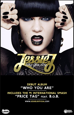
This magazine advertisement of Jessie J's album 'Who you are' shows the bold female artist aligned in the centre of the advert. This connotes she is the main focus point and the most important piece of information on the advert. The artist is positioned in a strong pose to connote female power and strength. Her hair and make-up have been done along with matching lipstick and nails. This suggests to the audience the artists style and the colour black connotes a dark side to this artist and the element of intimidation. The text positioned below the image is in the colour gold which helps the title to stand out from its dark background. This colour connotes wealth and success which may be used to reflect on this artists career. The bold title is in a serif style of font which is feminine and luxurious. The album name is under the artists name which connotes the artist name is more significant. The album name is in white which makes it stand out from the background and makes it clear to see on the advert. This is also in a serif font relating back to the feminine and luxuries style of the advertisement. A black area has been used under the image and title to allow for clear comments about the album including, the artists most famous and successful song ("Price Tag" feat. B.O.B.) which people will recognise and may persuade them to buy the album. Finally, the advert includes the artists website URL. This is used to persuade the audience to visit her website to learn more about her as an artist and to influence them to buy concert tickets and her albums / songs.

The Horrors:
The Horrors advertisement of their upcoming album shows a clear and large image of the band themselves sitting down. This helps the audience to recognise the band and may connote the band are laid-back and chilled which may reflect in their music. and on this album. The image is in black and white which connotes they have a dark side and links to the bands name of "The Horrors" which connotes the band are rock or metal based to the audience. The image also include a wolf's head in the background. This is made significant and bold by the white background and the alignment. The wolf's head connotes the band are scary and have a evil element to their style and music. The wolf is a vicious and feared animal which may relate to the impression the band want to send out to the audience looking at this advert. The title of the band and the album have been positioned at the top of the advert and is coloured white. This is used to make it bold, clear and important to the audience. The font is in a san-serif style which connotes masculinity and power. This links to each letter being in upper case. The album release date is aligned at the bottom of the advert which suggests it is less significant. However, it is in a white font which makes it stand out from the background and making it clear to read. Finally, under the release date is reviews about the album. These are positive reviews to persuade and encourage the audience to buy the album and to check out this band. It also includes the bands tour date and website URL, which helps to persuade the audience to visit the website and to buy tickets to see the band live.
Example:
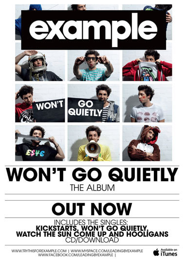
The magazine advertisement for artist: Example's album includes a bold title which the audience are drawn to when the first see the advert. This is made clear by the black background colour and the white san-serif text. The san-serif font connotes the masculine side of the text as well as making it bold and clear to read. The title is aligned at the top of the advert, in the centre, this connotes it is the most significant piece of information on the advert. The album name is imbedded in the various images in the centre of the advert. The images show the artist in each photograph which helps the audience to relate and recognise the artist and their music. The album name is also in bold bald text on a white background at the bottom of the advert. Having the album name twice on the advert connotes this is the most important piece of information on the advert. Underneath this text is the words: 'OUT NOW'. This is used to tell the audience to get the album instantly and to go and listen to his music. The advert also includes the artists other singles and popular songs. This is used to help the audience recognise the artist from his songs and may cause the audience to buy the album as they will have listen to these songs as they are his most successful and popular. Finally, the advert includes the symbol and text of iTunes. This is a popular place to get music and will be recognisable to the audience and also connotes the artists success being on iTunes.
No comments:
Post a Comment