Wednesday 29 April 2015
Sunday 12 April 2015
Music video audience feedback survey
Please fill out my survey below by clicking on the link: Thank you
https://docs.google.com/forms/d/1iP1yL5y1RQZHub_-hmIdkLD8z0bsoGBEAhRuShaYXD8/viewform
https://docs.google.com/forms/d/1iP1yL5y1RQZHub_-hmIdkLD8z0bsoGBEAhRuShaYXD8/viewform
Friday 27 March 2015
Music Video
This is my first draft of my music video. I am very happy with the aesthetics of the video and believe it looks professional and matches the songs rhythm perfectly. I have tried to include each member of the band even due to the loss of the lead singer and have included as much live footage as possible. I believe there may be some imperfections which I can adjust or change to improve. Overall, I am very pleased with the first draft result.
Wednesday 18 March 2015
Update on progress
After beginning the editing stage of my production, I came across a problem with lack of good footage which meant I had to change my idea for my band music video. I have changed my idea to a montage style including the band playing live, in the studio, funny moments etc. Therefore, I can still use my good footage filmed from the bands gig.
I am going to attend the band studio session to get some footage filmed which I can hopefully use for my music video.
Editing


I began the editing stage of production by collecting all my footage from the Cases gig and point of view shots and imported them in. I am using Vegas Pro 12.0 to edit my music video becuase its the editing programme I am most comfortable using. I am also using it due to me having it available at home which means I can edit my music video frequently. I started by importing the song, 'Let us drown' by my The Case as this is my chosen song and will help me with the arrangement of my footage. I then began to add titles including, production logo, presents, the bands name and finally the song name. All the titles are in magneto bold font to match the bands logo etc. I then began to enter footage between the titles to create my opening for my music video. This is where I came across a problem. There wasn't enough good footage to help me fill the duration of the song. This is due to all the footage being from one night. My idea was to have point of view of a fan traveling to see the band play live and to go backstage. However, this meant I could only get a certain amount of footage.
Therefore, I have to alter my idea. I have chosen to change the idea of my music video to a montage of the band playing live, in the studio and funny moments etc. This idea was popular in my previous survey and I believe will make a great music video. The montage style also links with the rock genre and it is a common style of music video used by rock bands such as Guns n' Roses (sweet child O' mine).
Below is my first attempt of editing down my P.O.V footage and live footage from the band gig:
Friday 13 March 2015
Update on progress
Now I have improved my ancillary texts, my digipak and my magazine advert, I feel comfortable moving onto the editing stage of my production. I will collect all my footage from the bands gig and the point of view journey, to begin to edit down into 4 minutes. If there is any more footage I need to complete the footage, I can go out to the studio or back into London to film the needed parts. I believe, I have gathered enough footage from the bands gig so hopefully no re-filming will be needed. On the other hand, the bands, lead singer has left the band which means more footage will be on the other band members. Overall, I am very happy with my progress so far.
Sunday 8 March 2015
Digipak draft 3

I have updated and improved on my digipak by adding colour and new photos. Firstly, I have made some of the text including the album name and numbers gold to match the advertisement and to add colour to the digipak as before it was a boring black and white look all over. Secondly, I have added my new production logo to the back cover and the CD itself. Finally, I have added two new photos to the digipak. One photo is positioned on the back cover, behind the song names and I have made it less opaque to allow the audience to see the photo however, still be able to read the information and song names clearly. Overall, I am very happy with the progress and development of my digipak and believe its look professional and aesthetically pleasing.
Friday 6 March 2015
Costume
The bands style/costume reflects each of their personalities from being trendy or the rock and roll look. Firstly, Frazer, the drummer wears trendy/hipster clothing such as, shirts, t-shirts, hats/caps skinning jeans and bowler hats. on his feet, he will wear vans or doc martins or just trainers. Callum, the guitarist, wears t-shirts on stage and has his long hair flowing with a fore head, band daner and skinny jeans. Off stage Callum wears hoodies and jackets including leather and denim. Tom, the guitarist, wears a flannel shirt or his leather jacket on and off stage with a t-shirt underneath and even no top underneath with skinning jeans with a chain, a hat/cap and a necklace. On his feet he wears high-top converse. George, the bassist, wears a flannel shirt but usually wears vests on stage to show his tattoos and skinning jeans with a hat/cap. He also has his ears stretched with a stretcher/plug inside. Off stage, he wears jackets including denim with at-shirt underneath and high-top converse. Finally, Riley, the singer, wears flannel shirts, with the sleeves rolled up to show his tattoo, skinny jeans, ear stretcher/plug and a hat/cap. Off stage, Riley wears beanies and jackets with a t-shirt or shirt underneath.
Each member of the band has their own unique style which represets them as a person and their personalities on and off stage. I think the band have a unique style however, still fit the rock/metal genre an conventions.


Saturday 28 February 2015
Magazine advertisement draft 4

Above is my magazine advert for my band, The Case. I have changed the advert vastly. Firstly, I have added a new photograph of the band as I believe it is clearer and overall better than my previous band photo. I have made it black and white which matches the codes and conventions as well as the rest of the advert. Secondly, I have added a purple and black patterned background as it looks aesthetically pleasing and adds dimension instead of a plain white background, and the colours are also related to the genre of rock / metal as they are dark and commonly used. I have added my new production logo and added outer glows to make it bold and stand out from the dark background. The lower half of the advert remains very similar with some changes including an outer glow on the bands logo to make it clear and bold, added lines to split up the information to make it clear to read, changing the red stars to yellow to make them stand out from the dark background and to add colour to the advertisement and finally changing footer to the website only. This is more commonly used on advertisements and I have highlighted, 'thecaseofficial' gold to make it bold and to match the rest of the advert.
Friday 27 February 2015
Production logo re-design

Update on progress
I attended a bands studio session to take some photos of them practicing which I could hopefully use in my ancillary texts. I used my digital camera and my phone to take pictures of the band and each individual member. It was challenging to take pictures which showed the bands energy due to the studio space which means the pictures taken may not be appropriate for the ancillary texts. For a better photographs I would need the band to have another gig which really shows the bands energy and performance on stage. However, I had taken some good photos from the photoshoot and the studio which may be suited. Overall, the session was helpful for me and allowed me to get a range of ideas and options for my ancillary texts.
Here are some of my successful photos:


Here are some of my successful photos:
These are some of the photographs which I thought were successful and with a few touch-ups and editing I think these photos could look really good.
Saturday 14 February 2015
Update on progress
Photoshoot:
I had arranged the band to meet up for a small photoshoot which would help me with my ancillary texts by getting arrange of photos of the band and them without their guitars etc. The location was abandoned, old, rural and beaten down which made it a perfect location for a rock/ metal bands photoshoot. Overall in was very happy with the results and now I am going to see if these photos will look aesthetically pleasing in my ancillary texts and if successful I will add them and re-design certain aspects of my magazine advert and my digipak.
These are some of the successful shots from the photoshoot:
Friday 6 February 2015
Update on progress
On the 31st of January the band headlined a gig at The Garage in London. This allowed me to film lots of various footage for my music video including travelling to the gig on the tube etc and filming the band backstage and while they perform their set. Filming all night has given me a range of different shots and footage to select from to edit down into 4 minutes. On the other hand the venue was very dark which made it hard for the camera to see and pick up lighting. The point of view glasses also struggled with the low key lighting however, this footage may still be able to uses if I can adjust the lighting levels in the editing stage of my production.
Sunday 1 February 2015
Filming at The Case's Gig - First shoot
The band had a gig in London at the Garage venue which I attended and filmed. I filmed the travel down to the venue using my digital camera. This included, footage of inside the train and walking into the venue. The venue was very dark and low key lighting which made it hard to film the venue itself. However, the stage included lighting which made the footage of the band clear to see. The point of view glasses struggled with filming in the dark which made the footage unclear and they struggled with fast movements which made shooting the band very hard because of their energy and movement during their performance. I got a variation of shoots including the travel down, the backstage area and on stage performance. Overall, the gig was successful and I have a range of shoots which I can choose from and edit down into 4 minutes for my music video.
Saturday 31 January 2015
Prop for my music video - The Case Calender

Above is my Photoshop made calender which will be featured in the beginning of the music video when the fan marks off the date.
I have added the month at the top of the calender to make it look professional and realistic. The font is Magneto Bold which is the bands typography and is in a red coloured font which makes it bold from the dark background and also applies to the codes and conventions of rock / metal genre. The main image is a photograph (Callum welsh Photography) of the band on stage at a gig. I have made the image black and white to fit the conventions of the genre and also makes for an aesthetically pleasing calender overall. Finally, I have added the dates and days at the bottom of the calender.
Magazine advert draft 3

After feedback from my teacher, I have adjusted elements of the advertisement to make the advert more visible and clear. Firstly, I have made the stars red. Making the stars red adds colour to the advert which it did not have before and therefore made aspects unclear and dark. I have also made the bands website at the bottom of the advert red to make it bold and stand out to the audience to make them see the website and check the band out. I choose the colour red as this was a common colour in the rock / metal genre and links back to the codes and conventions of that genre. I have made the photo of the band larger to make it more visible and bold. Finally, I have made all fonts bold and Italic and have changed the font of the "includes the singles..." sentence to allow the audience to clearly read the font and text as well as to match the rest of the advert. This also helps the audience to recognise songs in the album and be familiar with the content of the album which persuades them to go and check out the band and buy their album.
Photo Credit: Callum Welsh Photography
Props for my music video - Backstage pass

Above is my Photoshop designed backstage pass, which will feature in my music video when the fan is able to go backstage and meet the band for autographs etc. I decided to include the bands logo at the top of the pass, making it bold and clear. Below, I have added text: "VIP Backstage pass", which clearly shows what the pass is. I have put this text in a red colour font to make it bold and clear from the dark background and also shows this is the most significant piece of information on the pass. Below, I have added the tour name, venue and date to make the pass look professional and realistic. Finally, I have added a gradient background which is similar to the bands logo and adds a aesthetically pleasing background for the backstage pass.
Autograph pen testing
I decided to do some autograph pen testing, to find out which pen was best suitable for autographs on the dark background of the posters. Below is the evidence. The gold pen was by far the best and provided a visible autograph. On the other hand, The red sharpie didn't really show up on the dark background of the poster. Therefore, For the autographs in the music video I will use the golden pen. The gold pen also makes for an aesthetically pleasing poster and the colour gold connotes wealth and success which links back to the band being growing and inspiring 'rockstars'.
.JPG)
Props for my music video - Posters
These are the posters I have made in Photoshop of the individual band members and a group band poster. All of these posters will feature in the music video and will be signed by each member in the music video when the fan goes backstage to meet the band. I decided to make all the photographs black and white as this is a common convention of rock / metal genre and provides aesthetically pleasing posters. The text font is Magneto Bold which is the same as the bands typography and logo. Therefore making the posters link with the other designs.


The group band photo includes the bands logo design and their names at the bottom of the poster. I have added their names at the bottom of the poster to allow for each member to autograph above their name in the music video when the fan goes to meet the band backstage. I have left the photo coloured to allow for the typography and logo to be clear and bold.

Photo credit: Callum Welsh Photography
Cameras

For my music video, I will be using a 14 mega pixel, Panasonic Lumix camera. The camera provides good quality video footage and is lightweight, making it easy for me to film and carry for my first person filming. The camera is easy to operate and is small making it easy to travel with to the venue as well as providing good filming footage for my bands music video.

I will also be using these glasses for my music video and my first person footage. These glasses include a build in camera which provides HD 720p quality. These glasses will make it easy for my first person filming and will enable me to use and see my hands in the footage which provides the audience with the sense as they are the fan in the music video and on they way to see the band play live and go backstage to meet them for autographs etc. The only concern with using these galsses is the quality of the footage as the venue is based in low lighting and the camera may struggle to focus on certain things in the footage.
Thursday 29 January 2015
Update on progress
Tomorrow I will be going along with the band to the studio where I will be taking photographs for my digipak and magazine advertisement and possible music video footage of the band performing etc. After collecting as many photographs as possible of the band I will decide which photos are best suited for my advert and digipak.
Friday 23 January 2015
Magazine advert draft 2
This is my second draft of my magazine advert. I have added a photograph of the band backstage together. I have made the photo black and white in Photoshop, to match the conventions of the rock/metal genre. I have made the bands logo smaller and placed it above the name of the album. The audience are drawn to the image due to its size on the advert which is important as this is the most significant piece of information on the advert.
Photo credit: Callum Welsh Photography
digipak draft 2

This is my second draft of my bands digipak. I have added photographs of the band including them performing on stage. I have made the photos black and white in Photoshop, which is a convention of rock/metal genre. The black and white images also relate to the other components of the album including the text and bands logo. The photographs allow the audience to see the band as they perform, practice in the studio and them casual backstage. I have also added a image behind the CD, which allows the CD side to match the rest of the album and adds an aesthetically pleasing background.
Photo credit: Callum Welsh Photography
Friday 16 January 2015
Another idea for music video
After thinking about the music video for my band, I came across an idea which could be an effective and imaginary concept.
The idea is a constant P.O.V of the life and journey of a fan of 'The Case', my chosen band. The P.O.V allows the audience to feel apart of the music video which is important and the music video must grab the audiences attention to keep watching and listening. The start of the video will include the fan waking up and receiving the tickets and backstage pass through the post, which I can make in Photoshop. The fan will excited and the day will pass to night time where the fan will be getting ready to travel to see the band. This involves meeting with friends and travelling e.g. on the tube. The gig will be set in London at the venue, The Garage where the band will be headlining a real gig. Therefore, the crowd is real and the performance is real. The fan will be at the bar with friends, drinking and having a laugh etc, until the band come on stage. The fan will position inside the crowd making the audience feel apart of the crowd and the gig. When the performance is over, the fan will be holding a backstage pass allowing him to go backstage to meet the band. The fan will be shaking and excited. The fan will get autographs, photos and have a drink with the band making him feel like one of them. The ending of the music video will be the fan travelling home and sticking the autographed poster or photograph of the band on his wall and the music video will fade out from there.
Update on progress
After making a digipak draft, I need to gather a range of photographs of the band together and as individuals. These photos will be used in my digipak design and may also be included in my advertisement. This involves me communicating with the band to organise and arrange a photo shoot with them.
Thursday 8 January 2015
Digipak draft

Above is a draft of my bands digipak design. I have included the bands logo and albums name on the front cover, along with a 'parental advisory explicit content' logo to warm audiences about the content in the album. I have included eight of the bands songs which are all original and create by the band.
To finish the digipak I need to gather a series of photographs of the band and each of the members to fill the blank sides. I aim to take a series of photos to give me a range of photographs to chose from without having to retake and rearrange a photo shoot. I have a idea of what the images are going to include. The bottom left will be the two electric guitarists: Tom and Callum. The top left will be a photo of drummer: Frazer. Finally, the top right, will be an photograph of bassist: George and singer: Riley.
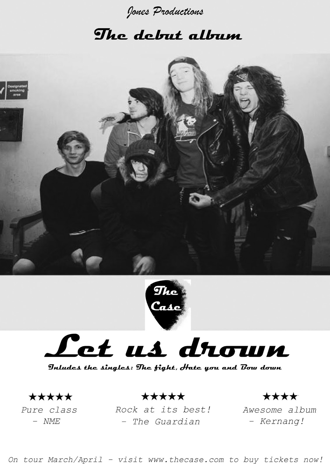
Magazine Advertisement draft

Above is my magazine advertisement for my band. I have created this advertisement on Photoshop. The advert includes the production logo, 'Jones Productions presents' which makes the advert look professional. I have included the bands logo which I have designed on Photoshop, in the centre of the advert as this is the most important piece of information on the advert and draws in the readers attention to the advert due to its design and its large size. I have also included the album name and debut text above and underneath the bands logo. Under the title of the album, I have stated songs which will be included in the album which the readers can identify and persuade them to buy the album due to the songs popularity and success. I have also included positive critic feedback and reviews of the bands album which helps to persuade the target market and readers to check out the band and buy and listen to their songs and album. Finally, at the very bottom of the advert I have included tour dates and the bands website which readers can go to to buy tickets to their upcoming tour and to check out the band further. I believe the simple design of the advert will help it stand out to the read with the white background making it visible and bold.
Shot list
This is an ordered shot list with the angles and timings with each frame and a small caption to tell you what is happening in each frame section.
Start:
Establishing shots of the band - Long shots - low angles (0:00 - 0:10)
Establishing shots of the band - Close ups on guitars, mid shots on drums (0:10 - 0:17)
Establishing shots of the band - close ups and mid shots of each member (0:17 - 0:36)
Long shots of build up of guitarists (0:36 - 0:40)
Build up drops - long shots and mid shots of band performing (0:40 - 0:52)
Close up on singer when vocals come in and long shots of band performing (0:52 - 1:18)
Long + mid shots +close ups - low angles - moving shots - Band performing chorus (1:18 - 1:41)
Second verse starts - montage of funny moments, backstage, getting ready etc. (1:41 - 2:07)
Chorus - long shots and low angles of band performing chorus - close ups on instruments (2:07 - 2:18)
Solo - mixture of guitarist playing and montage footage of the band (2:18 - 2:59)
Montage of funny moments, backstage etc. all shots and angles (2:59 - 3:24)
Chorus and closure of song - longs shots and mid shots of band performing - low angles - moving camera shots - slow motion footage (3:24 - 3:46)
Ending with band together - fade out into black (3:46 - 3:56)
End.
Album Cover draft

Above is my album cover for my bands album. I have chosen to include the bands logo on a white background to make it stand out. The simplicity of the design makes it aesthetically pleasing and the white background will help it stand out on the shelves in stores. I have include the album name and the name of the song I will be using for my music video. This is in the same typography font: Magneto. Its in black font colour to stand out from the background and to make it clear and bold. The black lettering can also connote tattoos which are stereotypical with rock/metal musicians and bands. Finally, I have included 'Parental Advisory explicit content' logo to the bottom of the album as it warns buyers that explicit content is used within the album and the songs.
Digipak draft

Chosen Typography + Logo

Above is my final chosen font for my bands typography. The font is called, Magneto bold. The font is stylish and as aesthetically pleasing. The font style reminded of famous speaker and music brand, Marshall. Therefore, it is a suitable font style for my band as they are in music and use the equipment made by Marshall. The colours are simple to make the the text stand out and to be clear. The black lettering is a convention of rock/metal bands which makes it appropriate for my band as they are in the same genre. The black lettering can alos be connoted as a tattoo style. This is also a convention and a stereotype for rock musicians and bands.

Above is my bands logo. The logo was created on Photoshop and includes the typography chosen. For the logo I have chosen to use a guitar pick. This relates to my band and the rock/metal genre of music which they play. I have decided to add some effects by making the pick look dated and to make the pick look like it is corroding and fading. This adds dimension to the logo and makes the logo aesthetically pleasing and unique. I have chosen white typography to make the text stand out from the black background making it clear to see and read. I have also added some effect around the lettering using a brush tool, to create the effect of wear and fade.
Subscribe to:
Posts (Atom)