
Jason Derulo - Tattoos:
This album CD cover of Jason Derulo's album, Tattoos includes the artists himself centred in the cover. This connotes that he is the most significant aspect on the cover. The image is in a cartoon/painted style with added tattoos to the artists neck which links to the name of the album. The word 'tattoos' is in a bold, black, serif font which makes it visible to the audience and in is the typical tattoo style. The tattoos on his neck include some of the artists song names and icons such as the trumpet on his ear which is a symbol for his song 'Trumpets'. Finally the artwork on his neck includes an eagle. This connotes that the artist is powerful and strong as well as being a famous symbol for america which is the artists nationality. The artists name is aligned at the top of the page positioned in the centre to make it clear and bold for the audience to see and recognise. The font is in a san-serif font and is white. This makes it stand out from the yellow background and the font represents masculinity and strength. Finally, the album includes a 'parental advisory explicit content' sticker which represents to the audience that the album includes explicit content such as swearing. The yellow background helps to make the images and fonts stand out and look bold which helps when the album is in a shop as it makes it outstanding to the audience.
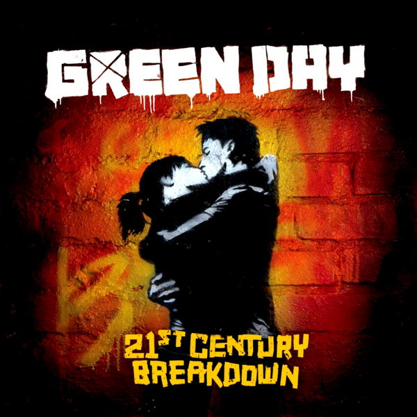
Green Day - 21st Century Breakdown:
This album of Green Days 21st Century Breakdown includes the band name aligned at the top of the cover in the centre, which is in a graffiti style, san-serif style of font and is coloured white. This makes it bold from the dark background as well as connoting that this is the most important piece of information on the album cover. The background and image are based in the graffiti style which connotes that their target audience for this album are teenagers and young adults which are stereotypically associated with graffiti art. The image also relates to their target audience as it shows too young people kissing connoting they are in a relationship. This image is related to the album name as the teenagers are based in the 21st century and the word 'breakdown' suggests that the 21st century has fallen apart or connotes its the overall summary of the 21st century. The album name is in a unique style of san-serif font and is yellow to stand out from the the dark, black background.

ACDC - Black Ice:
This album cover for ACDC's album: Black ice shows the band name aligned in the centre of the cd cover. The font is in a large text font and is coloured red which makes it bold and stand out from the black background. The text also includes an ice effect on the letters to relate to the name of the album (black ice). The bands name/ logo also includes a lightning bolt in the centre of the letters which connotes the bands power as well as being a symbol for the bands name relating to two currents. The album name is in a white text with a added black fade. The text is is a san-serif font which connotes the bands masculinity and strength. Finally, the background shows interesting shapes such as wings and includes horns which relates to the bands famous song: Highway to hell. The images are black and white which relates to rock bands and artists. The background also includes the silhouette of the lead guitarist with his fist up in the air. This connotes to the audience the bands strength and power. Personally, I think the album CD cover, looks like a vodka bottle label which links to the rock and roll lifestyle of drinking a lot of alcohol.

Slash - Apocalyptic Love:
This CD cover is famous guitarist, Slash's album: Apocalyptic Love and includes the artists name at the top of the album aligned in the centre. The text is coloured white and is in a san-serif style of font which connotes that the artist is masculine and makes the name stand out from the black background. It also connotes it is the most significant piece of information on the album cover. The cover also includes other artists names which are involved with the songs in this album. These names are positioned under Slash's name and have been placed on a banner to make them stand out from the images as well as fitting with the artwork below. The album name is positioned at the bottom of the album cover and is in a red, san-serif font which makes it bold from the dark background and the colour red relates to the name of the album as red is associated with love. The images are aligned in the middle of the album cover and include artwork such as an angel and a devil which are both woman which relates to the rock and roll lifestyle of having sex with lots of woman. Snakes, skulls and dinosaur skulls are also involved in the mixture of artwork and connotes the artist is dark and involved with rock and metal which are commonly associated with skulls etc. Slash's guitar and famous top hat have been aligned in the middle of the mix to connote they are the most important pieces of artwork and makes them clear to the audience and helps them recognise the artist with these symbols.
No comments:
Post a Comment