Metallica:
Metallica are a extremely famous rock and metal band. Their unique font style screams rock and metal and can be instantly connoted as a font for a rock/metal band. The long 'M' and 'A' at the begging and end of the font give the font style dimension and a unique touch. This also connotes to me an image of, horns or knives which are dark and scary related items which relate to the rock and metal genre and conventions. The font is black which is typical for a rock band and connotes the band are dark and scary which may relate to their music genre and style. The black font colour reminds me of black tattoo lettering which is stereotypically related to rock musicians and bands.

Bring me the horizon:
Bring me the horizon have a very unique and interesting font style. The bands logo reminds me of a graffiti style of font painted on a wall. The big lettering and font sizes make the band logo and font bold and clear. The font style connotes to me a tattoo style of font with the lettering and imagery around the text and the black colour the font is in. This relates to the rock genre as it is stereotypical that rock musicians and bands have tattoos. The font includes both serif and san-serif styles which work nicely together to produce and aesthetically pleasing logo and text. The dripping text also connotes rock and dark metal as it can be represented as blood dripping. The white text is bold and helps to stand out from the black background.
Guns 'N' Roses:
The Guns 'N' Roses logo and typography looks dated and warn out. The typography looks like it has been engraved with add dimension to the font. The dark brown/black colour connotes the colour f guitars used by the band and the rock genre. The font is in a serif style of font which is more popular in the rock and metal band typography. The font is clear and bold around the logo and can be instantly recognisable. The font style has a western feel to it which links to the name of the band including guns.
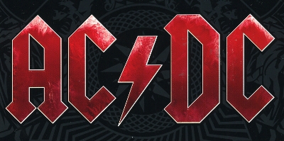
AC/DC:
AC/DC's typography is in a serif style of font with sharp edges which connotes the rock and metal genre of music. The font is unique and is aesthetically pleasing which makes the band logo so recognisable and well known. The lightning bolt in the middle instead of a slash has been used due to the bands name relating to electricity. The lightning bolt also connotes the rock and metal genre. The font includes and ice effect around the lettering which relate to their album being called. 'Black Ice'. This adds a unique feel to the text and makes the font creative and interesting. The colour red has been used as the font colour which can connote blood, being related to dark metal genres or love, which maybe a topic of their songs. The colour red connotes the colour of Iron Man the marvel superhero. This is because the band have made the soundtrack to the iron man films.
No comments:
Post a Comment